• DTTS1

    Don’t Talk To Strangers’ is a blog focusing on collecting urban stories; these are then reworked into animation, illustration or song. The creators encourage visitors to the blog to leave a recorded message, on their skype address: dttsanimation or telephone: 020 3290 4348, describing a story, experience or thought. You may also simply email your tale to donttalktostrangersproject@gmail.com. The blurb reads: ‘Life in the city surrounded by strangers can bring about unexpected encounters. We want to hear your stories; from the awkward, alienating or unpleasant to the amusing, bizarre or touching. Call and leave us a message or drop us an email of a thought, experience or story. Our team of artists will pick stories and bring them to life through animation, illustration or song.’

    ‘The Man Inside Mickey’ is the project’s first episode; a curious and creepy anecdote concerning an unexpectedly charged encounter with a poorly impersonated Mickey Mouse.  Retold by an anonymous female voice, the quality of the recording suggests the tone of an answer-phone machine.  The animator, Daniela Sherer, adopts a minimal and scrappy 2D digital aesthetic common to graphic tablet sketches. The seemingly naïf style combines a limited colour palette with a pleasing line boil. The unsophisticated, uninhibited drawing style skillfully supplements the sinister nature of the short narrative.

    DTTS2

    ‘The Man Inside Mickey’ is the first and only episode available. A blog post from May 2013 states the project was put on hold while the group focused on their graduate films. Christine Hooper, the producer, has been in-touch to explain they team have taken a ‘strategic pause’ while they apply for funding. The ‘Don’t Talk To Strangers’ team is mostly made up from the Royal College of Art’s Animation MA 2013 2013 graduate year. On show in June at the RCA’s animation exhibition was Daniela Sherer’s marvelous nine-minute 2D digital short ‘The Shirley Temple’, an animation where mimesis and storytelling is reduced to the point of abstraction. We wish Daniela, Christine and their collaborators luck in gaining funding to develop the ‘Don’t Talk To Stranger’ project.  A few more stories from the public may help spur them on (hint, hint).

    If any animators or illustrators are interested in getting involved then please get in touch via donttalktostrangersproject@gmail.com

  • Following the devastation of Hurricane Katrina in 2005 the people of New Orleans slowly began to rebuild homes and lives while trying to process what their community had endured. Lawrence Andrews presents the theatrical retellings of related events by a local man referred to as ‘Noel’. The retelling of his memories are further influenced by the tragic police shooting of unarmed civilians who were crossing the Danziger Bridge six days after the hurricane. This incident left two people dead and four seriously injured. Noel draws upon his personal archive of sound recordings and photographs to prompt a performance of his own narrative, interwoven with those of his community and the bridge victims.

    OB1

    Initially produced in 2008 as an audio essay, ‘OwnerBuilt’ was redeveloped and released this year as an ‘Animated Performance Documentary’. Andrews appears as a character throughout the 49-minute sequence; narrating, contributing editorial notes and analysing the authenticity of Noel’s accounts. Andrews’ dialogue with Noel becomes integral, his presence noticeably influencing the process of documentation. A misunderstanding concerning Noel’s neighbours sparks an account of their plight along with a strange instance where Andrews witnesses Noel talking about him to the neighbour.

    OB2

    Andrews is overtly self-aware as a filmmaker. He anchors the film in the context of a post-documentary age. The audience is handed frequent reminders that we are watching a set of illusions. For instance Andrews declares that Noel’s son is responsible for the sound of a cello being practiced. “Well actually it’s my son, his played sax,” the director declares immediately afterwards.

    OB3

    Sound seems much more integral to this film than visuals. Not only is the sequence entirely dependent on spoken word, the sound design is speckled with effects and textures which construct images in the absence of visual stimuli.  While most animated documentaries attempt to augment a narration by visualising the subject matter, Andrews renders himself and Noel on a darkened stage with harsh spotlights.

    OB4

    In step with the film’s non-linear structure, surreal aesthetic and confronting subject matter, the characters move with an uncanny jitter. While the lip-synching is often so slight it is barely noticeable, the speakers ceaselessly gesticulate. Their shifting bodies and stiff waving hands swing more vigorously than implied by tone of voice while maintaining rough correlation with emphasis. Lawrence Andrews seems to revel in the artificiality of the medium he has chosen. On occasion characters walk through each other, merging their digital flesh.  While describing the approach of the storm a flock of audience seats spin and float in the auditorium like particles in a snow globe.

    OB5

    Noel’s speeches are almost lyrical; to me this implies an extraordinary aptitude for improvised speech or the possibility of rehearsal or scripting. Andrews addresses the theatrical nature of Noel’s performance in the blurb provided with the Vimeo link: “Presenting the work in what may be deemed a theatrical form has the potential to de-legitimize and thwart its claims for documentary status, but this is a tension I hope the project explores.”

    OB6

    Lawrence Andrews’ Vimeo notes offer good insight; despite using the barely digestible rhetoric of academic arts, the associate professor of film and digital media at The University of California, Santa Cruz, explains thoroughly his intentions, raises questions for further exploration and indicates the contextual framework for his practice.

    Samantha Moore brought this film to our attention. Moore is a director of animated documentaries whose work has been discussed a number of times on this blog.

  • Jess Iglehart evokes the saturated vibrancy and graphic language of early nineties television to aid in the illustration of this rock and roll anecdote.

    an1

    Matt Pinfield, the MTV host, recalls an encounter with a sheriff of Aberdeen, a small town in Washington State. Pinfield recounts the cop explaining a claim to fame by digging out a mug shot of two of the members of Nirvana, Kurt Cobain and Krist Novoselic, who were arrested in the town as teenagers for doing graffiti.

    an2

    Pinfield’s resonant voice and enthusiasm for music mythology is infectious. This story, despite appearing a little frivolous, holds great currency in the sphere of popular culture. Most significantly we are offered a glimpse into Kurt Cobain’s youth, nine years before the tragic figure ended his own life. Pinfield and Iglehart expose a more naïve time for the bandmates; a time of boyish misdemeanours and rude illustrations.

    an3

    Jess Iglehart echoes the counter culture tone of Nirvana’s music with a playful mocking of the authority figures in the story; throbbing donuts are depicted behind the sheriff as he talks, and Iglehart implies that the cops had nothing better to do in the small town than paint their nails. While I am sure Iglehart had no intention for this film to be recognised as an objective document, there are clear prejudices in the material. Although these comments on the police are valuable for their humour, they are also transparent in their exaggeration and distort the viewer’s experience of Pinfield’s account.

    an4

    The animation’s colour palette creates a great sense of nostalgia. This is further augmented by the simulated effect of a VHS tape being fast-forwarded and Iglehart’s decision to adopt the font used in the band’s logo for the place names on the map of Washington State.

    an5

    Commissioned by MTV, this short is one of a series based on Matt Pinfield’s Rock Stories.  Jess Iglehart is a Los Angeles based animator & illustrator currently in his fourth year at Cal Arts in the Experimental Animation programme.

  • Ben Barrett-Forrest has constructed a charming introduction to the field of typography. This topic, which over the years has enthralled a certain type of graphic designer, has also left the rest of us puzzled as to what all the fuss was about.

    THOT1

    Forrest’s short educational film provides a carefully measured level of insight; not so much detail that a newcomer to the field feels overwhelmed but enough substance to make them appreciate they are learning something.

    THOT2

    As Ben is the only name credited in the film it is fairly safe to assume this was a solo experience. Whilst the cut out paper technique employed is engaging in its simplicity, the addition of pixillated hands certainly must have complicated the production process. The result being the film exists just beyond what one could imagine achieving single-handed.

    THOT3

    ‘The History of Typography’ has functioned as a promotional tool for Forrest Media, Ben Barrett-Forrest’s graphic design practice. The animation has received over 500 000 views on Youtube and a further 74 000 on Vimeo, as well as being featured on mainstream North American online media. It is rewarding to see how independent animation can function as a vehicle to generate business in this way.

  • Florian Maubach documents his bicycle journey from Kassel, Germany, to the coast of Lithuania. In one minute twenty Maubach convinces us of his reverence for landscape, passion for adventure and artistic dynamism.

    iki1

    The viewer adopts a satellite perspective while the surroundings immediately visible to the cyclist distort into a miniature globe. This frenetically changing sphere helps communicate the joy associated with propelling ones self across great distances.

    iki2

    Further definition is added to his activities and various modes of transport through clear and simple sound design, avoiding the use of a narrator. For instance, his passage through the town of Palanga is punctuated by both the name appearing briefly across the skyline and a ringing of his bell. The visual emphasis placed on the movement of the sun and the moon helps abbreviate the passage of time in this very short film.

    iki3

    In the final moments Maubach breaches the realism of his constructed universe by having the character jump up from the sea, cling on to the sun, plunging the world into darkness. It might be fair for one to assume this is a playful metaphor gesturing the traveller’s triumph over nature.  While this decision reduces the film’s authority as a descriptive document, its location at the very end minimises such an effect. As credits are bound to break all cinematic illusions, this filmmaker seems to have recognised an opportunity for conceptual freedom in the seconds beforehand.

    iki4

    The 2012 student film, made at Kunsthochschule in Kassel, has screened at 14 festivals across Germany and the rest of Europe. I found the cheerful simplicity of concept and execution in this film resonant and refreshing.

  • Irish Folk Furniture [clip] (2012) from Alan Eddie on Vimeo.

    https://vimeo.com/59224188

    We must have been busy with all sorts of of other things here at the blog (we have! – more soon) as it’s taken us a few months to catch up with this short which won the Short Film Jury Prize for Animation at Sundance this spring.

    It has screened at many festivals, including Sheffield Doc/Fest this June, who described it thus:
    “A strikingly beautiful stop motion animation exploring a local craftsman’s restoration of rural furniture in a small Irish community. Experimenting with the vivid expression of folklore storytelling, artifacts of bygone days are transformed from decaying neglect and brought to life, with playful vivacity.”

    An interview with director Tony here:
    http://irishamerica.com/2013/03/irish-folk-furniture-an-interview-with-tony-donoghue/

    And various news reports here:

    And here:
    http://www.thejournal.ie/sundance-irish-folk-furniture-763455-Jan2013/

    The film was funded by the Irish Film Board’s Frameworks scheme:
    http://www.irishfilmboard.ie/funding_programmes/Frameworks/65

  • I Met the Walrus’ is the animated extension of an extraordinary interview that took place in 1969. A fourteen-year-old Jerry Levitan, armed with a reel-to-reel tape machine, snuck into John Lennon’s hotel room in Toronto. The ‘Beatle’ rewarded the teenager’s pluckiness with an interview that contains the distillation of the musician’s message of peaceful protest. Thirty-eight years later Levitan adopted the role of producer on this short animated documentary, providing his original recording as the source material. The teenager’s naïve interview style, along with the kind authority with which Lennon imparts his wisdom, constructs a wonderful sub-narrative; the dynamic of master and student.

    IMTW1

    The director and animator, Josh Raskin, expands on Lennon’s words with a stream of images that complement the verbal content. The camera manoeuvres around a constantly developing two-dimensional graphic field, new images sprouting out from the previous area of focus. Much of the imagery correlates directly to phrases they depict, but on occasion this deviates from literal representation. For instance, when discussing how one could combat the establishment of a nation suppressing its people, Lennon states: “…the only thing they [the establishment] don’t know about is non-violence and humour.” The moment the last word of this sentence is uttered an illustration of a humerus bone bounds on to the screen. The pun behind this visual/verbal collision is instantly absorbed while echoing the point that comedy can be powerful and elegant.

    IMTW2

    This animation is littered with carefully thought out imagery that strikes a balance between augmenting Lennon’s words without distracting from them. The pace at which pictorial components are introduced is strangely rhythmic. Such a mesmeric stream of audio-visual information allows little room for the viewer’s mind to drift.

    IMTW3

    James Braithwaite provides the distinctive plethora of pen illustrations. Influence from William Heath Robinson’s eccentric machines can be detected in Braithwaite’s retro style. The turn of the century artist drafted impractically complex and counter intuitive industrial activities. A comparable wit and tension is notable throughout ‘I Met the Walrus’.

    IMTW4

    Alex Kurina is credited as a computer illustrator. This new media artist is likely to be responsible for the modern edge that acts as a counterpoint to Braithwaite’s traditional pen drawings.

    IMTW5

    Although the division of labour between Raskin, Braithwaite and Kurina is not entirely clear, what can be said for certain is that the team have created a rich visual language that balances past and present. Traditional forms of illustration help conjure nostalgia for the era. These are subtly contrasted with modern pink graphic components, along with snappy swivelling camera motions. For five minutes this film evokes the excitement felt by a teenage boy as his hero indulged his enthusiasm. ‘I Met the Walrus’ has won all manner of international animation awards, received over two and a half million views on YouTube and was Oscar nominated for best animated short film in 2008.

  • Melih Bilgil’s ‘A Brief History of the Internet’ employs a distinctly simple visual language to depict a series of complex communication and technology developments. We are hurtled through the historical contexts of various breakthroughs that collectively lead to the invention of the World Wide Web.

    abhoti1

    This animation project was conceived as a vehicle for showcasing Bilgil’s graphic design concept, PICOL. Short for ‘PIctorial COmmunication Language’, the project consists of a set of standardized signs developed to represent various features of electronic communication. The designer hoped that these icons would join existing examples, such as play/pause, creating a richer vocabulary of universally understood symbols.

    abhoti2

    The director’s desire to cover the subject comprehensively is at times in conflict with the need to engage the audience, which creates a consistent element of discord. A feature common to many educational films is the interference created when entirely forgettable technical or historical referencing distracts from interesting learning points. The result of this is that the viewer’s short term memory is preoccupied by frivolous detail rather than the core subject; for example, the numerous acronyms that litter the script.

    abhoti3

    In this film, a number of concepts, such as the decentralized network architecture, are enhanced by graphic visualizations. These reduced models communicate the dilemma and solution elegantly. However, occasionally the imagery does not expand upon or condense the verbal explanation. Instead it repeats the narrator’s script and the feeling of tautology creeps in.

    abhoti4

    ‘A Brief History of the Internet’ is comprehensive and stimulating. Occasionally it loses stride but ultimately one is left with the feeling they have learnt something useful.  Melih Bilgil lives in Munich where he works as a freelance multidisciplinary designer.

  • The Meth Project is a U.S.A. based anti-drugs campaign created in response to the ‘growing Meth epidemic’. It makes use of online and broadcast media in order to dissuade teenagers from ever trying methamphetamine. The highly addictive illicit drug is associated with depression, suicide, serious heart disease, amphetamine psychosis, and violent behaviour. Prolonged abuse of the substance is often indicated by physical deterioration such as loss of teeth and emaciation.

    Four animation directors from the London based Studio AKA were commissioned by the advertising agency Organic, Inc. to create short narrative animations for The Meth Project. The harrowing and frank films are based on firsthand stories of young addicts. During each sequence the narrator states their age and when they started using meth. Collectively the six films indicate the horrors of this chemically and culturally poisonous substance.

    Kristian Andrews directs three of the stories:

    https://vimeo.com/31813354

    Bernadette – Directed by Kristian Andrews

    Bernadette’s account addresses the guilt she feels over a friend’s suicide. Kristian Andrews uses tone to symbolise naivety and consequence. We are initially introduced to two friends who are constructed out of delicate, transparent line drawings in a bleached-out room.  However, harsh under lit shadows appear in the bedroom as drug use ensues. Finally abstract blotches blacken the screen when Bernadette reflects on her guilt. The unexpected cut directly to an image of the gun in the friend’s mouth effectively represents the crushingly arbitrary nature of the young girl’s decision to end her life.

    Oriah – Directed by Kristian Andrews

    Oriah recounts the shame he feels about the violence he directed towards his family. A visual contrast is created between recollections of being high and the sober interview. When depicting the moments of intoxication sources of light are over exposed and smeared, the virtual handheld camera is either up high or near the ground at an oblique angle. The characterisation of Oriah when he is high is rapid moving and rhythmically awkward. This is contrasted by the relatively static talking-head shots where Oriah discusses his shame.

    https://vimeo.com/31813626

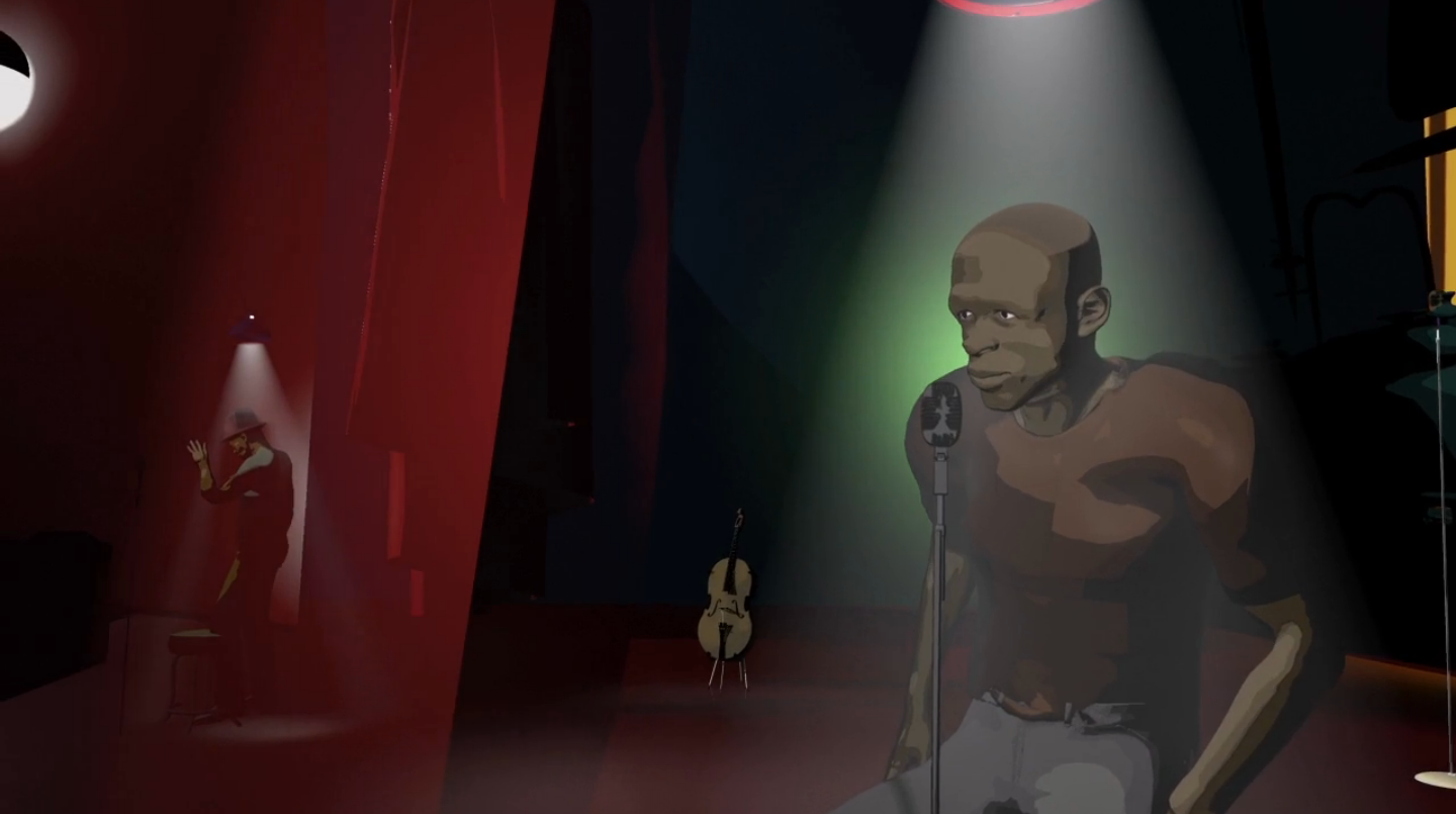
    Kara – Directed by Kristian Andrews

    Kara’s story refers to a near death experience in which her heart stopped briefly. The narrator’s greatest shock comes from the realisation that her drug addled friends did very little to help. Following a red and black scene showing Kara’s palpitating heart, Andrews reintroduces the viewer to the stark black and white external world. The camera rotates around her body as supporting characters slide in and out from the darkness in sync with her narration. This extraordinary scene keeps pace with rapid leaps in narrative while maintaining a strong feeling of cohesion.

    Grant Orchard directs two of the personal stories:

    https://vimeo.com/31813761

    Rochelle – Directed by Grant Orchard

    Rochelle’s story addresses drug-induced hallucinations.  Orchard was charged with the difficult task of indicating the horror of visual disturbances, without glorifying or underplaying the experience. He depicts simultaneous images jostling for space on screen. Individually such symbols would not induce much stress, but in the context of the dense composition they are exposed for a period of time that is too short for them to be fully processed. In a further attempt to evoke disgust Orchard incorporates metamorphosis; faces spawn out of one another like cancerous cells dividing out of control. Rochelle’s account also indicates a twisted rationalisation associated with addiction. “And even when I was loosing everything and everything was going to go, I knew I still wanted to get high. That’s the one thing I knew.”

    https://vimeo.com/31813458

    Hailey – Directed by Grant Orchard

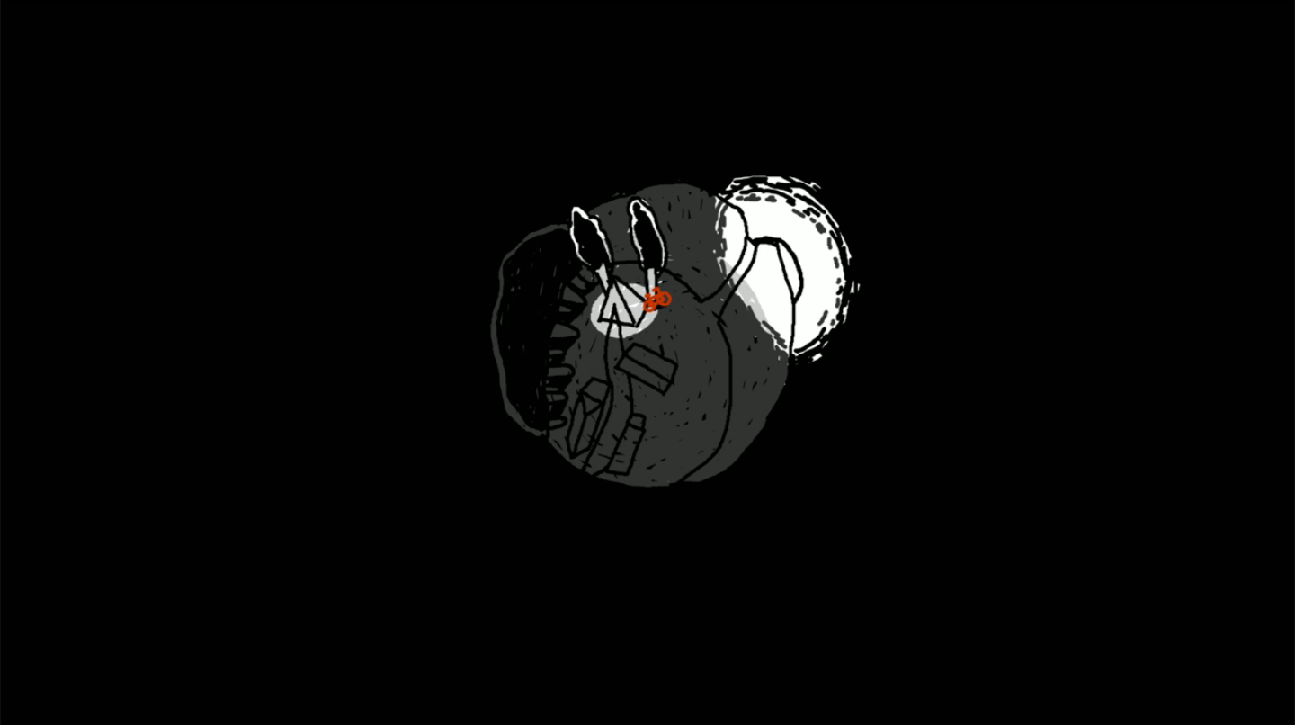
    Hailey’s story addresses the visible signs of bodily deterioration that are associated with prolonged meth use. Orchard sets a virtual camera descending through a stark black and white environment speckled with floating blotches. In this space the narration is expanded upon when figurative elements spread out from a point. To further unsettle the viewer gravity is inverted so that dribbling black marks stream upwards. The quality of line and overall aesthetic seems to suggest etching prints.

    One of the films is a collaboration between Steve Small, director, and Dave Prosser, designer.

    https://vimeo.com/31813244

    Ashley – Directed by Steve Small – Design by Dave Prosser

    Ashley’s narrative starts by referring to a particular hallucination that led her to cut open her arm to look inside.  From a jostling point-of-view camera the animated arm quivers, this is matched by the scrappy mark making.  A crisp edged, gently growing, crimson pool of blood starkly contrasts the loosely painted and drawn grey-scale arm. The second scene, in which disfiguring acne is described, suggests the use of a hand held camera. This creates a sense of intimacy with the character, as we feel noticeably present in the bathroom with Ashley.

    Studio AKA was also commissioned to create a series of stand-alone illustrations. These echo the reoccurring starting-age theme found in the six animated films.

    A colleague suggested animation might have been chosen for this campaign as the medium is traditionally associated with young people. Teenagers are the campaign’s target audience so many of the conventions of children’s animation have been circumnavigated, instead these sequences do hold much of the angst, gloom and tension connected to the first stumbling years of adulthood. Adolescent recklessness collides with life altering consequences, often indicating personal growth and the taking of responsibility. Perhaps these films chime with their audiences by updating the visual language instilled by cartoons in childhood.

    This set of challenging animated documentaries make up the ‘Personal Stories’ subsection of the Meth Project’s YouTube Channel, each video has received between ten to twenty thousand views.

  • “An inspirational conference lab on the current trends of new media providing access to new information, intense networking and individual support for transmedia projects linked to documentary or animation.

    Friday & Saturday, 1 & 2 November 2013

    The DOK Leipzig Net Lab 2013 is a two part conference lab open for transmedia creatives, thinkers and makers. It offers intense individual support for your cross-media project, with an in-depth look at interactive storytelling and media architecture.

    Film-makers, media professionals and transmedia creatives are invited to apply with their multi-platform projects linked to documentary and/or animated film. Up to eight projects will be selected from all applications and the head producer and two team members are invited to participate.

    Deadline for project entries: AUGUST 18, 2013

    Filmmakers, media professionals and transmedia enthusiasts without a project are also welcome to attend. Please apply till: SEPTEMBER 18, 2013.

    We offer participants with and without projects new insights and inspirations on transmedia storytelling and production and provide a platform to exchange, network and join forces with experienced colleagues and media professionals.

    Costs:
    Participation fee with project (day 1 and 2): 250 € per project incl. 7% VAT and one festival accreditation amounting to 80 €.

    Participantion fee without project (day 1): 120 € per person incl. 7% VAT and one festival accreditation amounting to 80 €.”

    More info at: http://www.dok-leipzig.de/industry-training/training/dok-leipzig-net-lab